Color
We want to be perceived as a warm and caring brand, as well as being functional and reliable.
By pairing and intersecting these attributes, we create a simple and unique color expression aligned with our "Simply Personal" concept.
Each color has a purpose and adds emotional value to our visual expression.
Table of Contents
Edit this section, Opens in new windowOverview
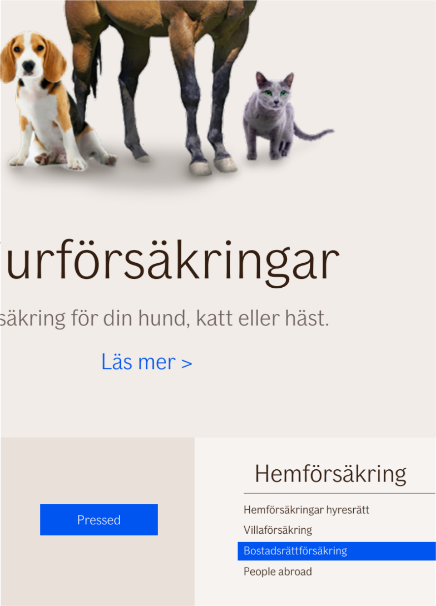
Our palette consists of one primary color: BL 1, BLUE. It is the color of our logotype and expresses loyalty, trust and professionalism. The BL 1, BLUE is a functional, eye-catching color used for interaction and activation, e.g. used for our primary buttons and links.
However, BL 1, BLUE should not be over used. Rather, it should be used to highlight key information.
Secondary colors are used to create a warm canvas for all types of content. Our beige colors, (BE 1, DARK BEIGE—BE 5, LIGHTEST BEIGE), are used as background colors, which together can be combined and used as dividers for layout purposes. Our brown colors, (BR 1, BROWN and LB 1, LIGHT BROWN), are mostly used for text and buttons.
To amplify the vitality and warmth of our palette, we use complementary colors that are used for content that needs color variation, e.g. for coloring infographics and styling in imagery as accent colors (props and clothing).
Palette
The If color palette reflects the tonality of the brand: uncomplicated, warm and personal. It fulfills specific functions and manages content effectively.
Our primary blue color, (BL 1, BLUE), is used in important graphic elements, such as the logotype, for interactive and activation UI elements such as primary buttons, hyperlinks, etc. On printed material, it can be used, for example, for highlighting key texts. The darker version (BL 1 DARK, DARK BLUE) is a shade of our primary blue color, and only used to support our primary blue color for states.
Our beige secondary colors, (BE), are used for backgrounds. Brown, (BR 1, BROWN), is used for text, web icons, and secondary buttons. However, for copy in text-heavy documents such as core communication and office printed documents, you should use black instead of brown. Light brown, (LB 1, LIGHT BROWN), is used for inactive web icons and/or buttons.
Complementary colors, red (CR), yellow (CY), green (CG), and blue (CB) are used for infographics and info boxes. They are designed to complement our primary and secondary colors.
- Accent (primary) - Logotype, activation
- Backgrounds (secondary) - Backgrounds and text colors
- Infographics (complementary) - Infographics, statistics etc.
Accent color
$ids-color-accentThe primary color, BL 1, BLUE, is the color of our logotype and expresses loyalty, trust and professionalism. The BL 1, BLUE is a functional, eye-catching color used for interaction and activation, e.g. used for our primary buttons and links.
However, BL 1, BLUE should not be over used. Rather, it should be used to highlight key information.
as it gets.
Read about child insuranceBackground colors
$ids-color-background-100$ids-color-background-200$ids-color-background-300$ids-color-background-400$ids-color-background-500Secondary colors are used to create a warm canvas for all types of content. Our beige colors, (BE 1, DARK BEIGE—BE 5, LIGHTEST BEIGE), are used as background colors, which together can be combined and used as dividers for layout purposes. Our brown colors, (BR 1, BROWN and LB 1, LIGHT BROWN), are mostly used for text and buttons.
Principles
B1
B3
B5
Usage
- BE 1, DARK BEIGE for hero sections/mood boards
- BE 3, LIGHT BEIGE or BE 5, LIGHTEST BEIGE for product cross links where studio images are used (open pages primarily) and other blocks for emphasizing sections of a page (all applications)
- BE 5, LIGHTEST BEIGE for content heavy sections and to be used instead of white.
- Certain components can have either BE 5, LIGHTEST BEIGE or BE 3, LIGHT BEIGE as a background color (for instance cross link areas, forms, etc, but should be used in moderation. Focus on as "light" as possible and use BE 5, LIGHTEST BEIGE mostly, but to maintain readability of content).
Text colors
$ids-color-text-subtle$ids-color-text-primary-on-light$ids-color-text-primary-on-dark$ids-color-text-primary-normal$ids-color-text-primary-inverseBrown, (BR 1, BROWN), is used for text, web icons, and secondary buttons. However, for copy in text-heavy documents such as core communication and office printed documents, you should use black instead of brown. Light brown, (LB 1, LIGHT BROWN), is used for inactive web icons and/or buttons.
Accessibility
For every background color, we have found a corresponding AA compliant text color as the default text color. We use a ratio threshold of 5. We recommend this tool to check your color contrasts: https://webaim.org/resources/contrastchecker/.
To see the code for this, you can head over to the color component page.
Large textAAAAA
Small textAAAAA
Large textAAAAA
Small textAAAAA
Large textAAAAA
Small textAAAAA
Large textAAAAA
Small textAAAAA
Large textAAAAA
Small textAAAAA
Large textAAAAA
Small textAAAAA
Large textAAAAA
Small textAAAAA
Large textAAAAA
Small textAAAAA
Large textAAAAA
Small textAAAAA
Large textAAAAA
Small textAAAAA
Large textAAAAA
Small textAAAAA
Large textAAAAA
Small textAAAAA
Status colors
$ids-color-status-error$ids-color-status-warning$ids-color-status-successThe GREEN color is used for success, safe, right. The RED color is used for error, danger, wrong.
These colors are only used for small notifications, warnings, feedback to the user about something that has happened. Like a new claim, new message in inbox, error message etc.
Accessibility
GREEN:Large textAAAAA
Small textAAAAA
Large textAAAAA
Small textAAAAA
Large textAAAAA
Small textAAAAA
Large textAAAAA
Small textAAAAA
Large textAAAAA
Small textAAAAA
Large textAAAAA
Small textAAAAA
Large textAAAAA
Small textAAAAA
Large textAAAAA
Small textAAAAA
Large textAAAAA
Small textAAAAA
Large textAAAAA
Small textAAAAA
Alert Banner colors
These colors are only used in notifications, and they are blended infographic and background colors. The colors are blended like this:
.color {
  mix-blend-mode: multiply;
  opacity: 0.5;
}
The text color allowed to be used with this background colors is BR 1, BROWN.
Infographic colors
$ids-color-infographic-100$ids-color-infographic-200$ids-color-infographic-300$ids-color-infographic-400$ids-color-infographic-500$ids-color-infographic-600$ids-color-infographic-700$ids-color-infographic-800$ids-color-infographic-900$ids-color-infographic-1000$ids-color-infographic-1100$ids-color-infographic-1200Complementary colors, red (CR), yellow (CY), green (CG), and blue (CB) are used for infographics and info boxes. They are designed to complement our primary and secondary colors.
as it gets.
Read about child insuranceStates colors
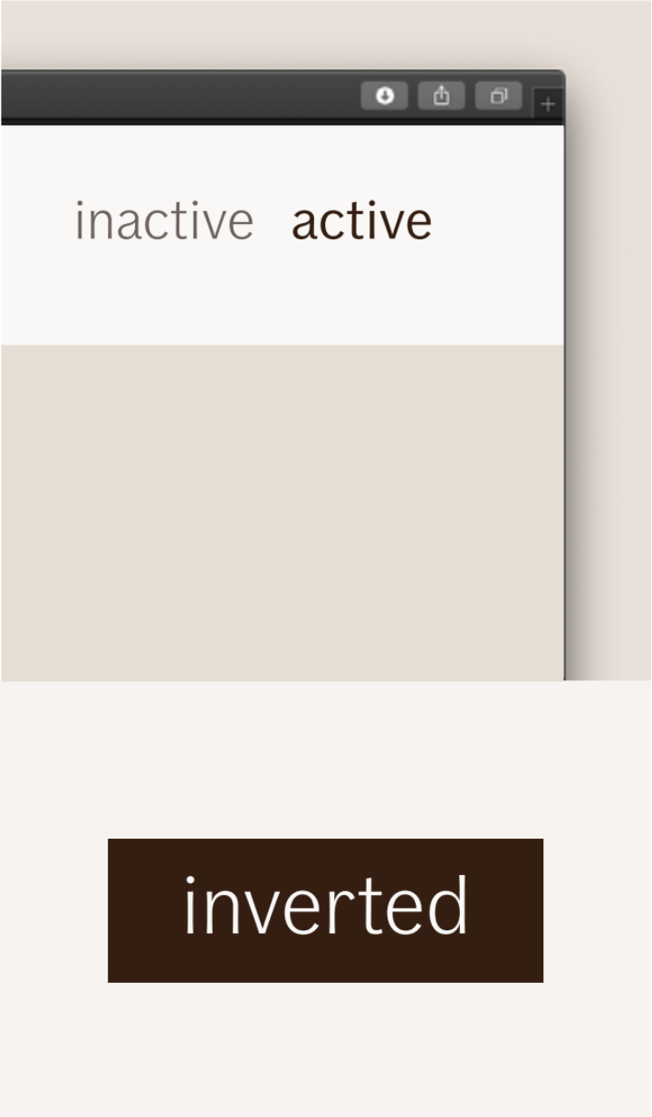
$ids-color-states-disabled$ids-color-states-active$ids-color-states-hover$ids-color-states-focusState colors are only for used with states like hover and active.
Edit this section, Opens in new windowCombinations
This chart shows the permitted color combinations of text color on our brand colors.
All If colors are tested according to WCAG guidelines for legibility (AA only) in digital environments.