Typography
<div class="if text lead">

    Our typeface; If Sans — plays a key role in our visual identity. It encapsulates our "Simply Personal" concept
    by being a functional typeface with a personal style. With a simple, light and airy feeling it offers a good
    legibility. With typographic details inspired by the written expression of calligraphy makes it human.

</div>
<div class="if text body">
Two typefaces are available for different applications:
- Our primary typeface is If Sans, which is used for all external, public-facing communication.
- Our fallback typeface is Arial, which is used for email communication and when technical limitations prevent
the use of the primary typeface.
</div>
<div class="if text ids-doc layout box">
<span class="if heading smallest">Demos</span>
- <a
href="/demos/typography.html"
class="ids-doc"
>
Typography
</a>
- <a
href="/demos/body-text.html"
class="ids-doc"
>
Body text
</a>
</div>Resources
Table of Contents
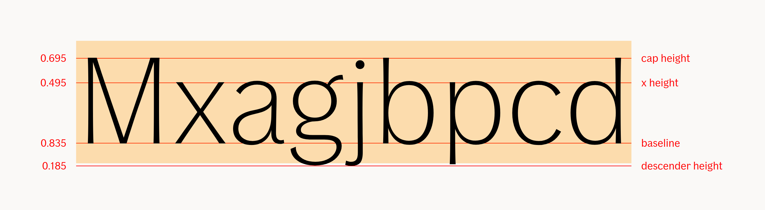
Edit this section, Opens in new windowTypeface overview
For a full page overview, you can check out the demo or read the documentation for the typography component.
The quick brown fox jumps over the lazy dog
The quick brown fox jumps over the lazy dog
The quick brown fox jumps over the lazy dog
The quick brown fox jumps over the lazy dog
The quick brown fox jumps over the lazy dog
The quick brown fox jumps over the lazy dog
The quick brown fox jumps over the lazy dog
Eventually, you do plan to have dinosaurs on your dinosaur tour, right? Yeah, but John, if The Pirates of the Caribbean breaks down, the pirates don’t eat the tourists.
Eventually, you do plan to have dinosaurs on your dinosaur tour, right? Yeah, but John, if The Pirates of the Caribbean breaks down, the pirates don’t eat the tourists. Do you have any idea how long it takes those cups to decompose. God help us, we're in the hands of engineers.
Eventually, you do plan to have dinosaurs on your dinosaur tour, right?
Eventually, you do plan to have dinosaurs on your dinosaur tour, right? Yeah, but John, if The Pirates of the Caribbean breaks down, the pirates don’t eat the tourists. Do you have any idea how long it takes those cups to decompose. God help us, we're in the hands of engineers.
Large mobile
Medium mobile
Small mobile
Font size unit
In this design system, we're using the REM (root em size) unit for font sizes. Browsers calculate REM based on the root element size. Default root element size is 16px. If you want pixels, multiply REM with 16. Want REM? Divide pixels by
Primary Typeface
If Sans is available in Thin, Light, Regular, Medium and Bold.
Thin, Light and Regular are used for large- and medium-size headlines and sub-headings to maintain our light and airy look and feel.
Medium and Bold are only used for small text sizes and to highlight key words in body copy.
An italic version is available in Thin Italic, Light Italic, Italic, Medium Italic and Bold Italic. These should be used to emphasize certain words or legal content. Never use italic in headlines or sub- headings.
If Sans should be used in most formats With the exception of digital platforms where it is only possible to use system fonts.
-
ABCČĆDĐEFGHIJKLMNOPQRSŠTUVWXYZŽabcčćdđefghijklmnopqrsštuvwxyzžАБВГҐДЂЕЁЄЖЗЅИІЇЙЈКЛЉМНЊОПРСТЋУЎФХЦЧЏШЩЪЫЬЭЮЯабвгґдђеёєжзѕиіїйјклљмнњопрстћуўфхцчџшщъыьэюяΩμΏĂÂÊÔăâêô1234567890‘?’“!”(%)[#]{@}/&\<-+÷×=>®©$€£¥¢:;,.*
-
ABCČĆDĐEFGHIJKLMNOPQRSŠTUVWXYZŽabcčćdđefghijklmnopqrsštuvwxyzžАБВГҐДЂЕЁЄЖЗЅИІЇЙЈКЛЉМНЊОПРСТЋУЎФХЦЧЏШЩЪЫЬЭЮЯабвгґдђеёєжзѕиіїйјклљмнњопрстћуўфхцчџшщъыьэюяΩμΏĂÂÊÔăâêô1234567890‘?’“!”(%)[#]{@}/&\<-+÷×=>®©$€£¥¢:;,.*
- If Sans Thin
- If Sans Thin Italic
Principles for headlines and sub-headings
The wide variety of type weights enables an airy and clear text group hierarchy, where headlines and sub-headings maintain an equal stroke width.
We have simplified the headline principles into three levels. Depending on the size of the headline, we balance the weights by headline and sub- heading to achieve equal stroke width.
Depending on the layout, the headline and/or sub- headline can either be centered or left-aligned. We use sentence case in all text.
Level 1 - Large headline- If Sans Thin, Line height/leading: 110-120%
- If Sans Regular, Line height/leading: 110-120%
- If Sans Light, Line height/leading: 110-120%
- If Sans Regular, Line height/leading: 110-120%
- If Sans Regular, Line height/leading: 110-120%
- If Sans Medium, Line height/leading: 120-130%
- Level 1 - Large headline
- Level 2 - Mid-size headline
- Level 3 - Small headline
Text Weight Principles
Often a headline.
2. Second Priority Message (SPM)Can be a sub-heading or preamble. It may not always be present.
3. Third Priority Message (TPM)Can be a preamble or longer descriptive text. It may not always be present.
The way we use the different type weights in our brand communication is very distinctive. To emphasize our light airy typography, we use a lighter type weight in headlines and go bolder as we go further down the text hierarchy. We do this so as to maintain an equal stroke width through all sections of text.
In the DO example you can see how we apply the type weights:
- If Sans Light is used for FPM.
- If Sans Regular is used for SPM.
- If Sans Regular is used for TPM.
Notice that no bolder weight than Regular is used for TPM/body copy. Medium and Bold weights are only used for small text sizes and to highlight key words.
Lorum ipsum dolor sit amet consectetur.
Sed ut perspiciatisunde omnisiste
Lorem ipsum dolor sit amet, consectetur adipiscing elit. Maecenas gravida nisl non eros hendrerit, eget imperdiet ipsum scelerisque.
Lorum ipsum dolor sit amet consectetur.
Sed ut perspiciatisunde omnisiste
Lorem ipsum dolor sit amet, consectetur adipiscing elit. Maecenas gravida nisl non eros hendrerit, eget imperdiet ipsum scelerisque.
Weight
-
R
-
R
-
R
-
R
-
R
-
R
-
R
-
R
-
R
-
R
-
R
-
R
-
R
font-variation-settings: "wght" 36;font-variation-settings: "wght" 40;font-variation-settings: "wght" 45;font-variation-settings: "wght" 48;font-variation-settings: "wght" 50;font-variation-settings: "wght" 54;font-variation-settings: "wght" 64;font-variation-settings: "wght" 70;font-variation-settings: "wght" 78;font-variation-settings: "wght" 82;font-variation-settings: "wght" 85;font-variation-settings: "wght" 104;font-variation-settings: "wght" 126;
Readability and typographic rules
To ensure the best use of If typography, please respect the following rules.
Here are some examples of incorrect usage.
Lorem ipsum.
NO UPPER CASE TEXT.
Lorum ipsum.
Fallback typeface
Arial is our universal fallback font. Some browsers, email clients and operating systems only let you use default typefaces. In situations where there are no other typeface options available other than the default, you should always use Arial in suitable and equivalent formats.
Arial is used in two weights: Regular and Bold.
-
ABCČĆDĐEFGHIJKLMNOPQRSŠTUVWXYZŽabcčćdđefghijklmnopqrsštuvwxyzžАБВГҐДЂЕЁЄЖЗЅИІЇЙЈКЛЉМНЊОПРСТЋУЎФХЦЧЏШЩЪЫЬЭЮЯабвгґдђеёєжзѕиіїйјклљмнњопрстћуўфхцчџшщъыьэюяΩμΏĂÂÊÔăâêô1234567890‘?’“!”(%)[#]{@}/&\<-+÷×=>®©$€£¥¢:;,.*
-
ABCČĆDĐEFGHIJKLMNOPQRSŠTUVWXYZŽabcčćdđefghijklmnopqrsštuvwxyzžАБВГҐДЂЕЁЄЖЗЅИІЇЙЈКЛЉМНЊОПРСТЋУЎФХЦЧЏШЩЪЫЬЭЮЯабвгґдђеёєжзѕиіїйјклљмнњопрстћуўфхцчџшщъыьэюяΩμΏĂÂÊÔăâêô1234567890‘?’“!”(%)[#]{@}/&\<-+÷×=>®©$€£¥¢:;,.*
- Arial Regular
- Arial Bold
Text flow
Below is two text flow examples. The first one is not adjusted to the baseline, but the second is.
-
Heading - Medium 1
Leading text with a bunch of other words. Just testing this out
This is the body text, we need to add some placeholder text here. Perhaps not the basic Lorum ipsum dolor sit amet text, but something else? We could do that, but not certain of which, there are so many! But what if we just type the first things that enters our mind, so that the user can just get a hint of what's going on here?
- Untouched
- With basekick text flow
- Normalized, with line-heights going up in 5 ( 40px, 30px and 25px)
Now, when we add lines to indicate line-heights (baseline), look how the text aligns with them:
-
Heading - Medium 1
Leading text with a bunch of other words. Just testing this out
This is the body text, we need to add some placeholder text here. Perhaps not the basic Lorum ipsum dolor sit amet text, but something else? We could do that, but not certain of which, there are so many! But what if we just type the first things that enters our mind, so that the user can just get a hint of what's going on here?
- Untouched
- With basekick text flow
- Normalized, same line heights
<div class="if text vertical-spacing-base">
    <h2 class="if heading medium">Heading - Medium 1</h2>
    <p class="if text lead">Leading text with a bunch of other words. Just testing this out</p>
    <p class="if text body">
        This is the body text, we need to add some placeholder text here. Perhaps not the basic
        Lorum ipsum dolor sit amet text, but something else? We could do that, but not certain of
        which, there are so many! But what if we just type the first things that enters our mind, so
        that the user can just get a hint of what's going on here?
    </p>
</div><div class="if text flow vertical-spacing-base">
<h2 class="if heading medium">Heading - Medium 1</h2>
<p class="if text lead">Leading text with a bunch of other words. Just testing this out</p>
<p class="if text body">
This is the body text, we need to add some placeholder text here. Perhaps not the basic
Lorum ipsum dolor sit amet text, but something else? We could do that, but not certain of
which, there are so many! But what if we just type the first things that enters our mind, so
that the user can just get a hint of what's going on here?
</p>
</div>Learn more
-
 Michael Taranto - Teaching CSS to talk like a designer
UI developers and visual designers, despite working very closely, often speak very different languages without realising it.
Michael Taranto - Teaching CSS to talk like a designer
UI developers and visual designers, despite working very closely, often speak very different languages without realising it.
-
 Why is Vertical Rhythm an Important Typography Practice?
"You probably heard of the term Vertical Rhythm if you researched a little about typography on the web. It’s one of the most important practices when working with typography."
Why is Vertical Rhythm an Important Typography Practice?
"You probably heard of the term Vertical Rhythm if you researched a little about typography on the web. It’s one of the most important practices when working with typography."